Energy
Vitality
Flair
Panache
Vibrancy
Zest

These are the words that my sponsor 'Bradstone' have given as my design brief. I am to incorporate 'Panache', an 80% recycled Bradstone product into the design and am to refer to the RHS web site for the exciting new Fresh Garden catagory. I discover that this requires a design response that is 'different, fresh, ground breaking, unusual, green' - amongst other words. It is recommended that I work to a 6 x 6m size, with boundaries on two sides, with viewing on two sides.

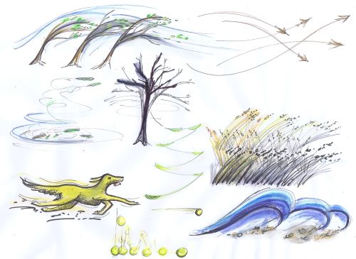
I begin by making some quick sketches of what these words mean to me personally, as personal experience always seems a good place to start; flying kites with the children - swirling kite tails, flashes of bright colours; going to a fair - spinning, roller coasters, lights, noise; fireworks night - explosions, awe, vibrant splashes of colour; ice skating and energetic dancing in colourful costumes,
Walking the dog on a windy day, throwing her ball, birds flying, grasses swaying, leaves wirling round.
All these feel like positive, happy experiences that reflect the words of the brief.
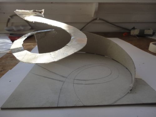
 I am advised that the RHS are likely to require construction drawings and information on the design, so begin by working on the 'Elephant in the Room' - the ribbon of colour! Initially I think about how it might be made using a Bradstone product, but after meeting with Bradstone product developers decide it may be better produced using lighter weight materials, to give a greater sense of energy and vitality. I then start to think about how to produce to ribbon in a light and gravity defying way!
  I consider leaves, similar to Andy Goldsworthys' fantastic creations but am worried about their frailty and durability over a 6 day show.
 I consider paper made from plants used in the garden and come up with this paper chain idea, but again am not sure how it will withstand the weather.
 I consider withies or twigs similar to the fantastic work recently produced by Tom Hare. I consider the Fresh garden brief and decide to push the idea further. Whilst walking through the woods near my home I am inspired by the life in find all around me - the ferns reaching for the light, leaves quivering, wood pigeons flapping up through the trees, Red Kites circling, squirrels dashing, deer leaping. Their movement and energy appears to be upwards in search of light, space and safety. This inspires a simple wing/ leaf shape that reaches upwards, changing its hue and form as it travels.
  I now have to work out what materials it is to be constructed from and, after a lot a agonising, decide to use man made materials to contrast more strongly with the naturals appearance of the woodland setting. I investigate a steel structure with Perspex 'leaves'
  These shapes then evolve into a colourful swirl that reaches upwards from the woodland floor towards the canopy, changing hue and scale as it travels. To me this is the spirit of energy and vitality in the woodland setting.